Over the past few months, Google has been testing the addition of “mobile-friendly” labels to mobile search results. This test has finally come to an end and Google has launched these labels in search, proving how important it is to have a mobile-friendly site.
What kind of effect can this have on your site? The answer is simple: less traffic. Remember that time you went to search for something on your smart phone, clicked on the result you thought was best and were brought to the desktop version of that site? What did you do? If you’re like most people, you left that site (and therefore drove up its bounce rate).
Moving forward, you’ll no longer need to assume that the site you’re visiting is mobile. Google has decided to now let the user know if the site is “mobile-friendly” or if it is not. This simple message can be the difference between traffic (more importantly, a lead) to your site and traffic to your competitors’ fully mobile-friendly site.
How to Test Your Website
So how do you know if you have a website that is mobile-friendly without actually talking to your web provider? There’s an app for that… or at least a tool, which can be found at:
www.google.com/webmasters/tools/mobile-friendly/
Simply click on the link above to be taken to a site that will easily tell you if you have a mobile-friendly site. If your site is friendly, then you should see something similar to the screenshot below.
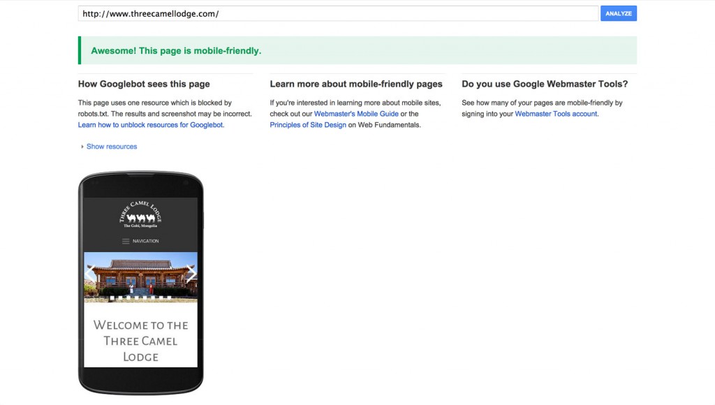
Google found that the site was mobile-friendly.
Keep in mind there will be some pages on some sites that might not be set up to rank in search. Some of these pages will include login pages, payment pages, etc. These pages are generally blocked with a robots.txt file and can trigger an error when looking for ranking pages. Although Google will still say these sites are “Mobile-friendly” they might show some errors at the bottom of the screen, below the smart phone image.
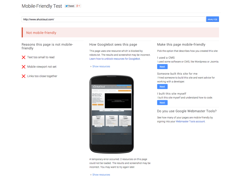
If your website is not mobile-friendly, you will get something that looks like:
 Tips To Keep A Site Mobile-Friendly
Aside from having a dynamic or responsive site, these are a few things that you can avoid to make sure your site shows a “mobile-friendly” label.
- Using faulty redirects
- Having a slow site speed for mobile pages
- Using text that can not be zoomed in on
- Using links that are not easily tapped on
- Having links point to pages that are not mobile-friendly
Need More Help?
If you find that your site is showing up poorly in mobile-search, gets labeled as a non-friendly site or just want more information on how to better optimize your site for mobile search, contact us today. We can talk about the steps you need to take in order to show up on a smart phone as well as you do on a desktop.